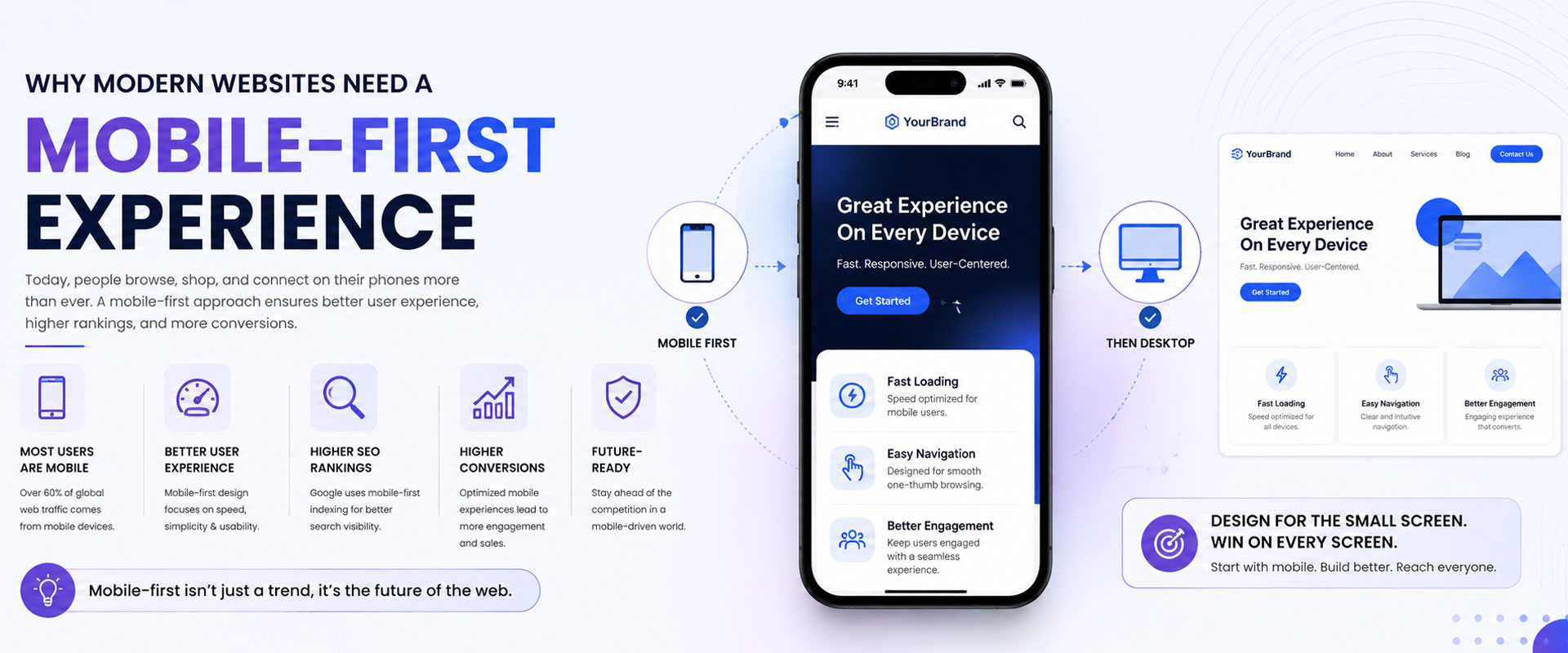
Why Modern Websites Need a
Mobile-First Experience

Introduction
In today’s digital world, users browse websites more on mobile devices than desktops. A mobile-first website is no longer optional — it is essential for businesses that want to improve user experience, search rankings, and online conversions. Modern websites must deliver fast loading speeds, responsive layouts, and seamless navigation across every device to keep visitors engaged and connected with the brand.
Why Mobile-First Design Matters
Mobile-first design focuses on creating websites optimized primarily for smartphones and tablets before scaling to larger screens. This approach ensures cleaner layouts, faster performance, and better usability. Since Google prioritizes mobile-friendly websites in search rankings, businesses with responsive designs gain stronger visibility, improved SEO performance, and better customer engagement online.
A responsive website automatically adapts to different screen sizes, creating smooth user experiences across mobile phones, tablets, and desktops. Visitors expect websites to load quickly, provide easy navigation, and display content clearly without zooming or excessive scrolling.
Businesses that ignore mobile optimization risk losing potential customers and damaging their online credibility. Mobile-first websites improve accessibility, engagement, and customer satisfaction while reducing bounce rates and improving conversions.
Benefits Of Mobile-First Websites
Mobile-first websites provide major advantages for businesses looking to grow online. Faster loading speed improves user retention, while responsive layouts create consistent experiences across all devices. Mobile optimization also enhances SEO rankings, increases website traffic, and strengthens online brand credibility.
A well-designed mobile experience improves customer interaction and encourages users to spend more time on the website. Better usability and responsive interfaces also increase lead generation, online sales, and overall digital performance.
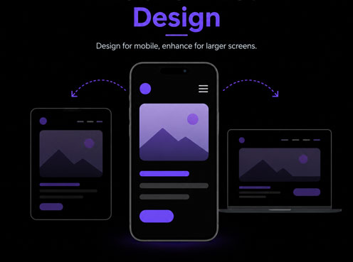
Responsive Design Experience
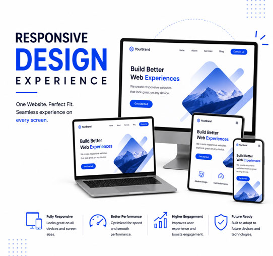
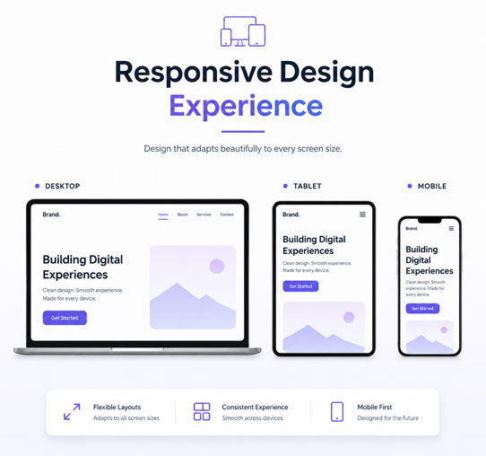
Responsive design ensures that websites function smoothly on every device without compromising design quality or usability. Modern layouts, adaptive images, flexible grids, and optimized content structures create seamless browsing experiences that keep visitors engaged and improve brand perception.
Improved User Experience
User experience plays a critical role in website success. Mobile-first websites prioritize easy navigation, readability, touch-friendly interactions, and faster performance to ensure users can access information quickly and comfortably. A smooth user experience encourages visitors to stay longer and interact more with the website.
SEO & Performance Optimization
Google’s mobile-first indexing means websites optimized for mobile devices are more likely to rank higher in search results. Optimized website speed, responsive structures, compressed media, and clean coding improve both SEO performance and user satisfaction.
The Future Of Modern Websites
As mobile usage continues to rise, businesses must adopt mobile-first strategies to remain competitive in the digital landscape. Future-ready websites focus on performance, accessibility, responsive design, and seamless user experiences across every device.
Mobile-First Development Process
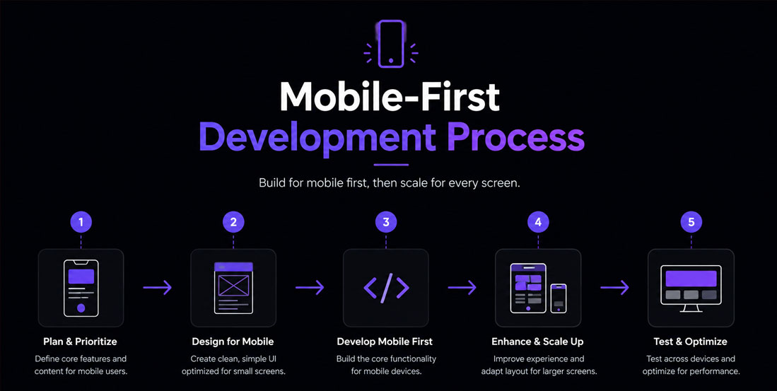
Creating a mobile-first website begins with understanding user behavior and designing layouts optimized for smaller screens. Developers then enhance responsiveness, optimize website speed, improve usability, and test performance across multiple devices to ensure flawless functionality.